
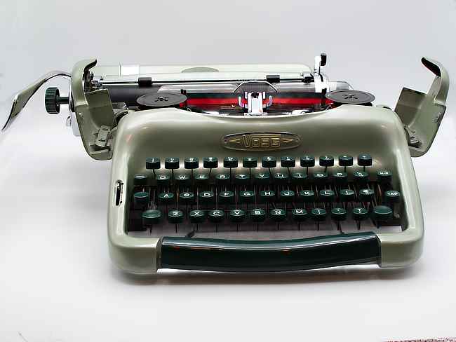

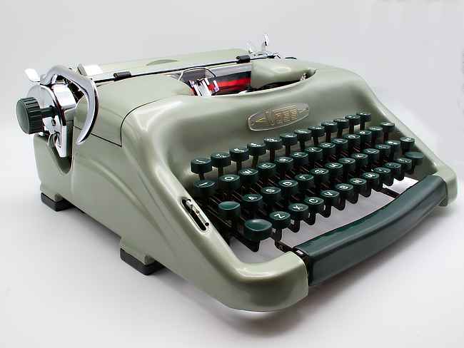
Overbuilt, overengineered, and curvaceous. Those are the words that I would use to sum up the Voss ST24, a portable typewriter made in Germany. The example that I own was made in 1955. It features what is referred to as the “smiley face” design, with gulling style ribbon covers that swing open on either side of the machine. Later versions of the ST24 featured a one piece ribbon cover along with a lower body shell designed to be separated into two pieces. Those two pieces are held together by clamps built into the design. (These later models would come to be known by some as the “frowsy face” machines.) If you head over to the Typewriter Database and peruse the images of the various ST24 models listed there you can quickly see how these two monikers came to be.
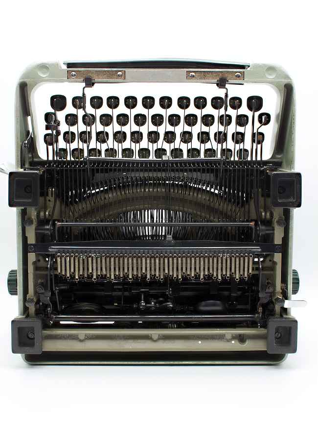
Looking over the ST24 in detail it is clear that few expenses, if any, were spared in its design and construction. The cast aluminum shell contains so few straight edges that it almost looks organic in nature. The outer shell covers an equally impressive cast aluminum frame underneath. Those surfaces that aren’t readily visible are all blued to help prevent oxidation/corrosion. The brightwork matches that of a luxury automobile with chrome that appears deep enough to swim in. In use this typewriter feels as if it has been carved out of one single piece of metal — incredibly solid. The ST24 is arguably the highest quality typewriter out of all of those that I’ve owned. (Note that my interests are limited primarily to mid-century typewriters.)
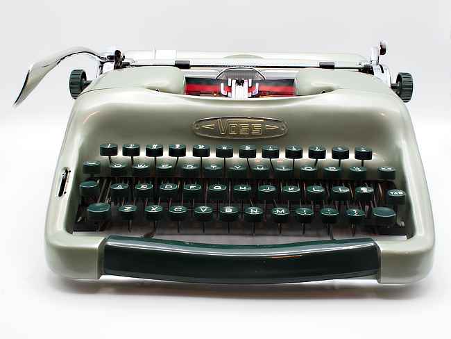
While everything on the ST24 appears to be somewhat thicker, more heavy-duty than needed, this machine still manages to weigh in at under 15 pounds thanks to the extensive use of aluminum in its design. Looking at it, one would likely guess that it weighs much more. This Voss is not what I would call a small-sized portable. The designers of this typewriter did not stop at overbuilding the various components that make up the ST24, they also designed a great deal of adjustability into many of these components as well. Whereas most typewriters require a repair person to “form” (i.e. bend) a multitude of parts to address various problems that might arise over time from use or neglect, the ST24 has built-in adjustments. These adjustments allow one to loosen a screw(s), adjust as needed, and then retighten the screw(s).
Clearly the Voss engineers and designers were committed to building a very impressive typewriter without the typical budgetary constraints. As impressive as this might be, there is an unintended downside as Matt McCormack (the owner of Ace Typewriter here in Portland) informed me. In the wrong hands, such a range of adjustments make it possible to really get things out of whack, screwing up the operation of the typewriter. This is likely when these machines manage to find their way to the likes of Matt and other typewriter repair personnel around the world. Good mechanical comprehension skills are needed to work on a machine such as this. Thus far after more than two years I have yet to suffer any ill effects due to the complexity of this machine, but I’ve cleary taken Matt’s words to heart.
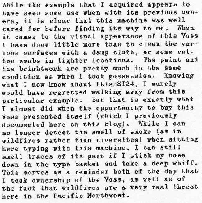
While the example that I acquired appears to have seen some use when with its previous owners, it is clear that this machine was well cared for before finding its way to me. When it comes to the visual appearance of this Voss I have done little more than to clean the various surfaces with a damp cloth, or some cotton swabs in tighter locations. The paint and the brightwork are pretty much in the same condition as when I took possession. Knowing what I now know about this ST24, I surely would have regretted walking away from this particular example. But that is exactly what I almost did when the opportunity to buy this Voss presented itself (which I previously documented here on this blog). While I can no longer detect the smell of smoke (as in wildfires rather than cigarettes) when sitting here typing with this machine, I can still smell traces of its past if I stick my nose down in the type basket and take a deep whiff. This serves as a reminder both of the day that I took ownership of the Voss, as well as of the fact that wildfires are a very real threat here in the Pacific Northwest.
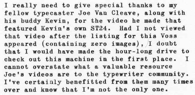
I really need to give special thanks to my fellow type caster Joe Van Cleave, along with his buddy Kevin, for the video he made that featured Kevin’s own ST24. Had I not viewed that video after the listing for this Voss appeared (containing zero images), I doubt that I would have made the hour-long drive to check out this machine in the first place. I cannot overstate what a valuable resource Joe’s videos are to the typewriter community. I’ve certainly benefited from them many times over and know that I’m not the only one.
In use I would describe this ST24 as a typewriter that just stays out of the way letting me get on with my writing for as long as I please. This is what I effectively mean by referring to a typewriter as being “snappy”. There is an incredibly direct interaction between the human input and the mechanical reaction to that input that I appreciate so much. While this tends to benefit fast typists, I still enjoy how this feels. This is one of the reasons that I am so drawn to German-made typewriters in particular. It might not be everyone’s cup of tea, but it certainly appeals to me.
The same could be said for the carriage-shift mechanism found on this Voss. While I ultimately prefer segment-shift designs, I generally don’t have any issues with carriage-shift designs. Those limited to segment-shift designs would best look elsewhere as there are no shortage of other great machines to choose from fulfilling this need. On a similar note, as with a few of the other typewriters that I own, there is no touch control to be found on the ST24. This does not present a problem for me as I find the touch perfect as it is. That said, I would note that when it comes to the typewriters that I own with touch controls I rarely have them set to their lightest setting so take my impressions with this in mind.
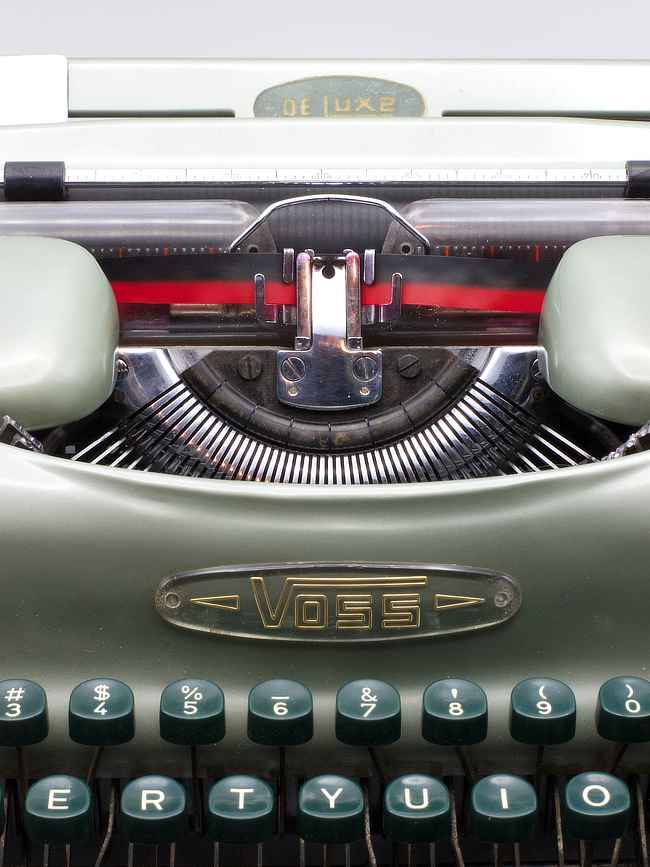
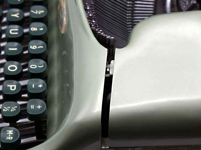
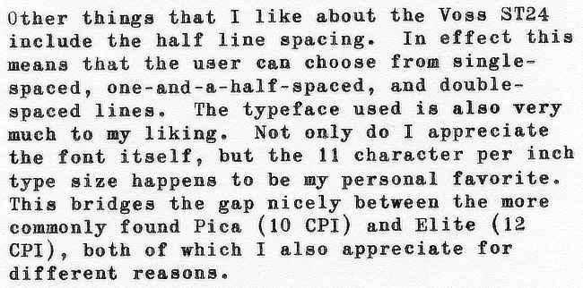
Dther things that I like about the Voss ST24 include the half line spacing. In effect this means that the user can choose from single-spaced, one-and-a-half-spaced, and double-spaced lines. The typeface used is also very much to my liking. Not only do I appreciate the font itself, but the 11 character per inch type size happens to be my personal favorite. This bridges the gap nicely between the more commonly found Pica (10 cpl) and Elite (12 CPI), both of which I also appreciate for different reasons.
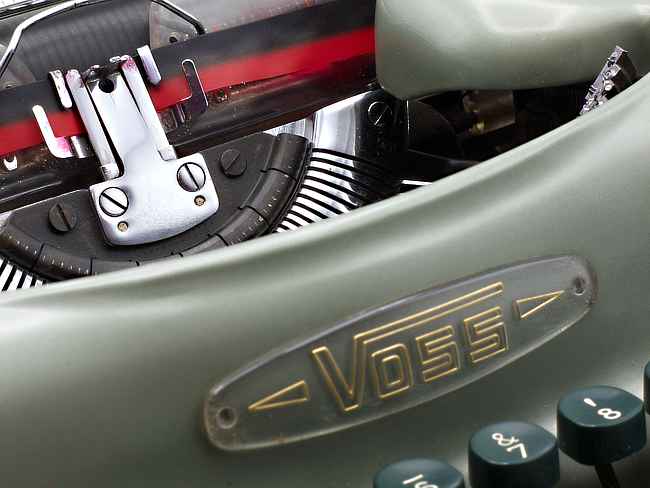
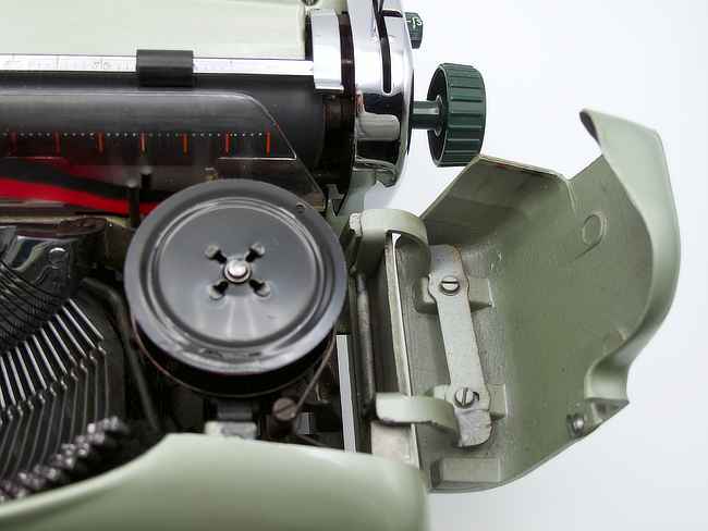
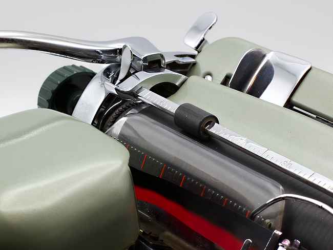
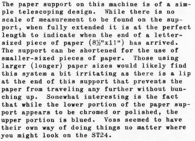
The paper support on this machine is of a simple telescoping design. While there is no scale of measurement to be found on the support, when fully extended it is at the perfect length to indicate when the end of a letter-sized piece of paper (8%”x11″) has arrived. The support can be shortened for the use of smaller-sized pieces of paper. Those using larger (longer) paper sizes would likely find this system a bit irritating as there is a lip at the end of this support that prevents the paper from traveling any further without bunching up. Somewhat interesting is the fact that while the lower portion of the paper support appears to be chromed or polished, the upper portion is blued. Voss seemed to have their own way of doing things no matter where you might look on the ST24.
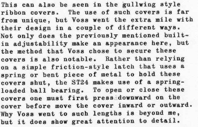
This can also be seen in the gullwing style ribbon covers. The use of such covers is far from unique, but Voss went the extra mile with their design in a couple of different ways. Not only does the previously mentioned built-in adjustability make an appearance here, but the method that Voss chose to secure these covers is also notable. Rather than relying on a simple friction-style latch that uses a spring or bent piece of metal to hold these covers shut, the ST24 makes use of a spring-loaded ball bearing. To open or close these covers one must first press downward on the cover before move the cover inward or outward. Why Voss went to such lengths is beyond me, but it does show great attention to detail.
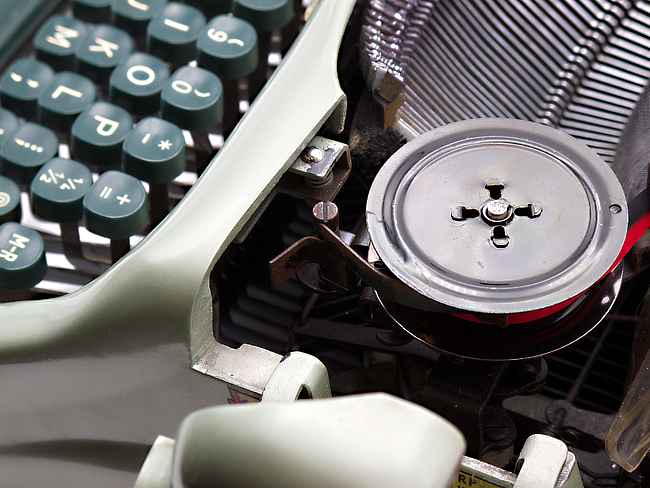
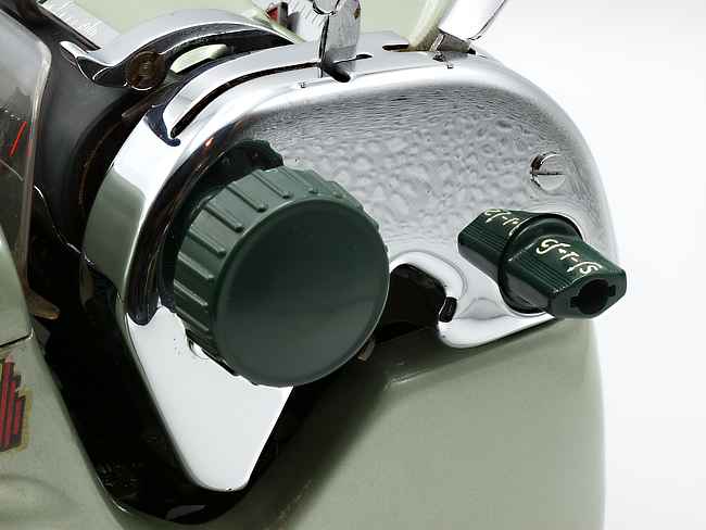
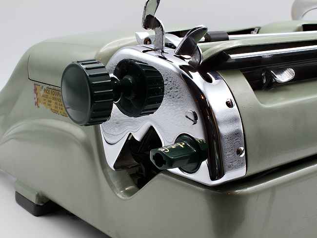
The tabulator controls are also an example of Voss marching to the beat of their own drum. In the case of the ST24, setting and clearing tabs is accomplished with a single “ovalized knob” (I’m not really sure what else to call it) located at the right end of the carriage.To set a tab, you turn this knob counter clockwise. To clear a tab, you turn it clockwise. To clear all of the tabs you press the knob inward. This reveals the only thing that is not working properly on my particular ST24. I’m assuming that the knob should automatically pop back out after being pressed in, but I am forced to pull this knob back out myself. It seems that this is a common problem among ST24’s according to Gerren over at the HotRod Typewriter Company.
While it doesn’t cause any issues with functionality, the biggest design fault that I’ve found with the ST24 is the space bar. Not only does it sit proud of the aluminum struck tune underneath, making it more susceptible to potential damage, but it is highly prone to warping. I actually thought this was an intentional part of the overall curvaceous design until I finally saw an image of a ST24 where the straight space bar was still intact. While not as offensive as something like disintegrating platen knobs, I’ll admit that I do find this to be disappointing in what is otherwise a near perfect writing machine. While the the thought of removing the space bar so that I could heat it up and straighten it out has crossed my mind, I’ve decided to leave well enough alone. After all, there is no such thing as a perfect typewriter in my opinion.
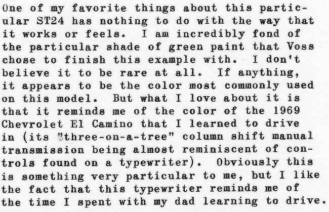
One of my favorite things about this particular ST24 has nothing to do with the way that it works or feels. I am incredibly fond of the particular shade of green paint that Voss chose to finish this example with. I don’t believe it to be rare at all. If anything, it appears to be the color most commonly used on this model. But what I love about it is that it reminds me of the color of the 1969 Chevrolet El Camino that I learned to drive in (its “three-on-a-tree” column shift manual transmission being almost reminiscent of controls found on a typewriter). Obviously this is something very particular to me, but I like the fact that this typewriter reminds me of the time I spent with my dad learning to drive.
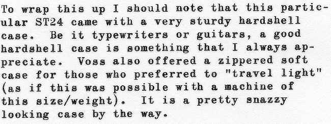
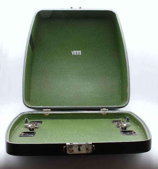
To wrap this up I should note that this particular ST24 came with a very sturdy hardshell case. Be it typewriters or guitars, a good hardshell case is something that I always appreciate. Voss also offered a zippered soft case for those who preferred to “travel light” (as if this was possible with a machine of this size/weight). It is a pretty snazzy looking case by the way.
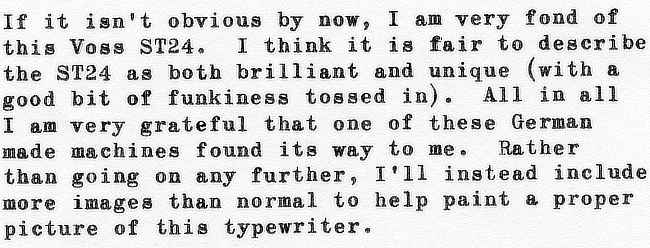
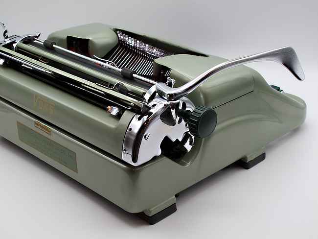
If it isn’t obvious by now, I am very fond of this Voss ST24. I think it is fair to describe the ST24 as both brilliant and unique (with a good bit of funkiness tossed in). All in all I am very grateful that one of these German made machines found its way to me. Rather than going on any further, I’ll instead include more images than normal to help paint a proper picture of this typewriter.
VIDEO RESOURCES (mentioned above):
Joe Van Cleave’s Typewriter Video Series – Episode 218 Voss DeLuxe
Dr. Typewriter – Venneburg Typewriters – Two Schmucks and a typewriter: ’50 Voss ST24
HotRod Typewriter Company – Voss Typewriter Repair Overview for Posterity (Gerren’s channel actually has a number of Voss ST24 videos)
AFTERTHOUGHTS: This Closer Look series is not intended to be set of reviews written from an impartial standpoint. However, as I’ve owned all of the typewriters in my possession for at least a year or more, I have spent a fair bit of time using them. So I thought that I would revisit some of my favorites, sharing my impressions of them from the perspective of a user rather than a collector. At the end of the day these are just one man’s thoughts and opinions. Your mileage might vary and all that. First up I chose what is likely the most interesting typewriter I own.
Great review, Guth! I suspect the space bar was warped because someone was in the habit of picking up the machine by that space bar! At, least, that’s one theory.
Thanks Joe. Your theory makes for some interesting pondering. Perhaps Voss should have drilled three holes in the shell, bowling ball style, to help avoid such temptations. 😉
Very good description of this magnificent machine. You’ve made me want to type on mine.
The earlier Vossi had bodies made of brittle plastic, and when they changed to aluminum they seem to have wanted to put that completely behind them.
Thanks Richard. Were you to grab your Voss for some typing enjoyment as a result of this post then I’ll consider it a success.
Oooh, now this makes me want one. Maybe the Thrift Gods will be kind to me this year (:
Obviously I took your recent letter to heart. 🙂
Of course I’ll be keeping my fingers crossed that the Thrift Gods treat you right.
Beautiful machine Bill! The spacebar on mine is curved as well. Someone told me a while back that it was bent, and I thought they were full of it because the curve matches the style of the machine so well.
I have the plaid soft case, but I sure do like that hard case.
Thanks Eric. It seems that my Voss is every bit as green as yours is maroon. I am hereby naming those ST24’s featuring body shells and keyboards in the same color scheme as the “double down” Voss machines.
Great article !!! I’ll read it carefully cause I have a Voos like this.
Thank you! I hope that your Voss brings you a great deal of typing enjoyment.
Hi, I have an Oliver badged Voss ST24.
Same colour as the one you have.
Do you know anything about them?it has no serial number, that I can find.
Hi Steve,
There is a very brief mention of an Oliver/Voss connection over on Robert Messenger’s excellent blog. I’ll include the URL below. NOTE: You’ll find more clues in the comments that follow the article.
https://oztypewriter.blogspot.com/2012/01/voss-portable-office-typewriter.html