
The plan had been to curtail my typewriter purchases as much as possible. I’ve actually been doing a decent job of it under some challenging circumstances. My wife and I recently spent a few days visiting Tacoma, Washington ~- where we stayed in the “Antique District”. As you might suspect, this area was full of antique stores and therefore I was surrounded by typewriters. To add to the temptation, most of those machines were priced lower than what comparable examples would appear for here in Portland. (Not that this came as a surprise. ) Yet I managed to avoid all such temptations.
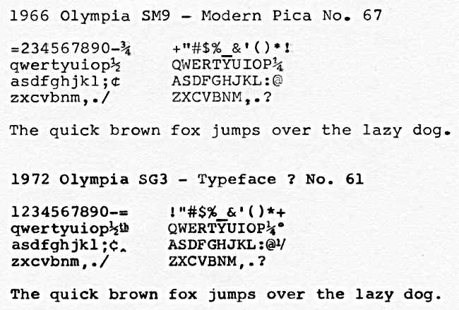
However, when an opportunity to purchase an Olympia SM9 featuring the “Modern Pica Noe 67” (to borrow Olympia’s specific terminology) arose, I let my guard down. The machine never even reached my max bid and now it is mine. While many like ten gush over cursive typefaces, Modern Pica is the sort of design that gets me excited• Those of you who are into the cursive typefaces should be grateful that there is one less person out there bidding on those machines online, or hunting them down locally (or in Tacoma as well as it turns out) for that matter.
I had been looking for a SM9 with this typeface since last year. Those machines that I did find ended up going to the homes of other typewriter enthusiasts and I .was beginning to lose f aith that I would obtain one of my own. I really should have known better. Now that I’ve had some time to spend with this SM9, I’ve come to realize that I am unable to identify the typeface on my Olympia SG3, which I had assumed was Modern Pica.
Taking a closer look at the type slugs on the SG3, I can see that they include the reference number 61, as opposed to the number 67 found on the type slugs of this SM9. In addition, the typeface on the SG3 is slightly smaller, with a bolder weight than this found on the SM9. Looking around on the web, I’ve yet to turn up any information on the SG3’s typeface No. 61. I wouldn’t be surprised to learn that such information exists, I just have not been able to locate it myself. Not yet that is, but I’ll continue to search. However, I’ll be honest, what I’m really hoping is that someone will read this blog post and come up with an answer for me. I’m sure someone out there knows the answer.
Such are the mysteries of the typewriter universe. While it would be nice to learn the answer to my typeface question, I’ll be sure to enjoy both this SM9 as well as my SG3 simply because I really like the look of their typed output. That sort of thing tends to matter to me. But I also realize that we are all drawn to these machines for a variety of reasons. The more the merrier as they say.
AFTERTHOUGHTS: As mentioned above, I had always assumed that the typeface found on my SG3 was Modern Pica. Glancing through the online reference materials that I was able to located, nothing else came close. It wasn’t until I began typing with the SM9 that I noticed the difference. That is what caused me to take a close look at the reference number on the type slugs of the SG3 as these two typefaces clearly differ from one another.
Hi Bill — I also have an Olympia typewriter, a 1971 SM9, with the no. 61 typeface. It’s why I bought it. After I’d had it a while, I found a photo of a 1997 letter from Justice Ruth Ginsburg that uses the same font. I’ve been meaning to blog about it, and you beat me to it. 🙂
The intertubes are an incomplete resource when researching Olympia typefaces, with the most easily found reference dated before the apparent introduction of no. 61 somewhere around 1970. (Although you’d think that 61 would come before 67, wouldn’t you?) I’ve accumulated two offline references whose provenance is undocumented, but which are obviously taken from official Olympia documentation. One of them looks like it might be from the late ’60s and lists no. 67 as “Copy Pica.” The other is a collection of specimen letters and lists both faces—but here, no. 67 is called “Modern Pica,” while no. 61 is called “Olympia Pica.” Incidentally, the typeface reference that begins on page 180 of Ted Munk’s Olympia SM Typewriter Repair Bible matches the latter document’s terminology.
So—Until someone posts an authoritative and complete list of Olympia typefaces and their names, preferably for each decade, I’d call the typeface in your SG3 “Olympia Pica” and call it good! Hope this helps. — John
Hi John, this is actually an incredibly entertaining answer, not to mention a rather informative one.
Even better, I like the sound of “Olympia Pica”.
Thanks for taking the time to respond!
Georg Sommeregger had posted type slug catalogs on his blog which covered many of the German and Swiss made typewriters. I forget who made the slugs for Olympia. The person who I know who may have your answer is no longer with us. Olympia slug numbers seem to be random even in their catalogs.
Folks in the typewriter community like to discuss all sorts of things when it comes to these machines. However, what isn’t discussed as much by those like me, being newer to this community, is the loss of knowledge that occurs whenever those who were intimately familiar with these machines and the details surrounding them leave us. Thanks for sharing Bill.
Hi Bill, I wish I’d known you were nearby, I’d have popped down. So where is this elusive Antiqu District in Tacoma? I may have to pay them a visit.
You may want to reach out to Paul at Bremerton Office Machine Company. He found the proper name for my Olympia typeface.
-Mike
Next time we take a trip up in your direction I’ll have to let you know in advance. The Antique District in located in the North end of downtown Tacoma, just north of the Theater District. This district seems to be primarily about Broadway Street, which has quite a few antique stores, I think I counted 5 stores in all that were open during our visit that had typewriters of one sort or another.
Thanks for the tip regarding Paul at Bremerton Office Machine Company.
Here’s one he has for sale now.
https://typespec.com/1958-brown-olympia-sm3-for-sale-485/
As you’ve noted in the past, italicized fonts have their place and that particular typeface looks quite nice. Is that the same typeface as found on your SM3?